Minimalism with a Touch of Luxury
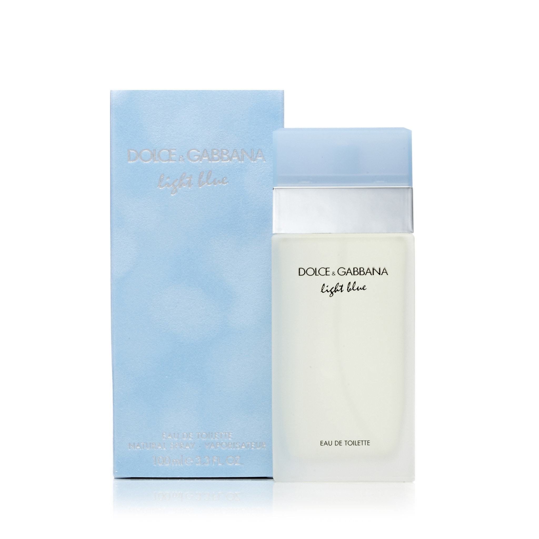
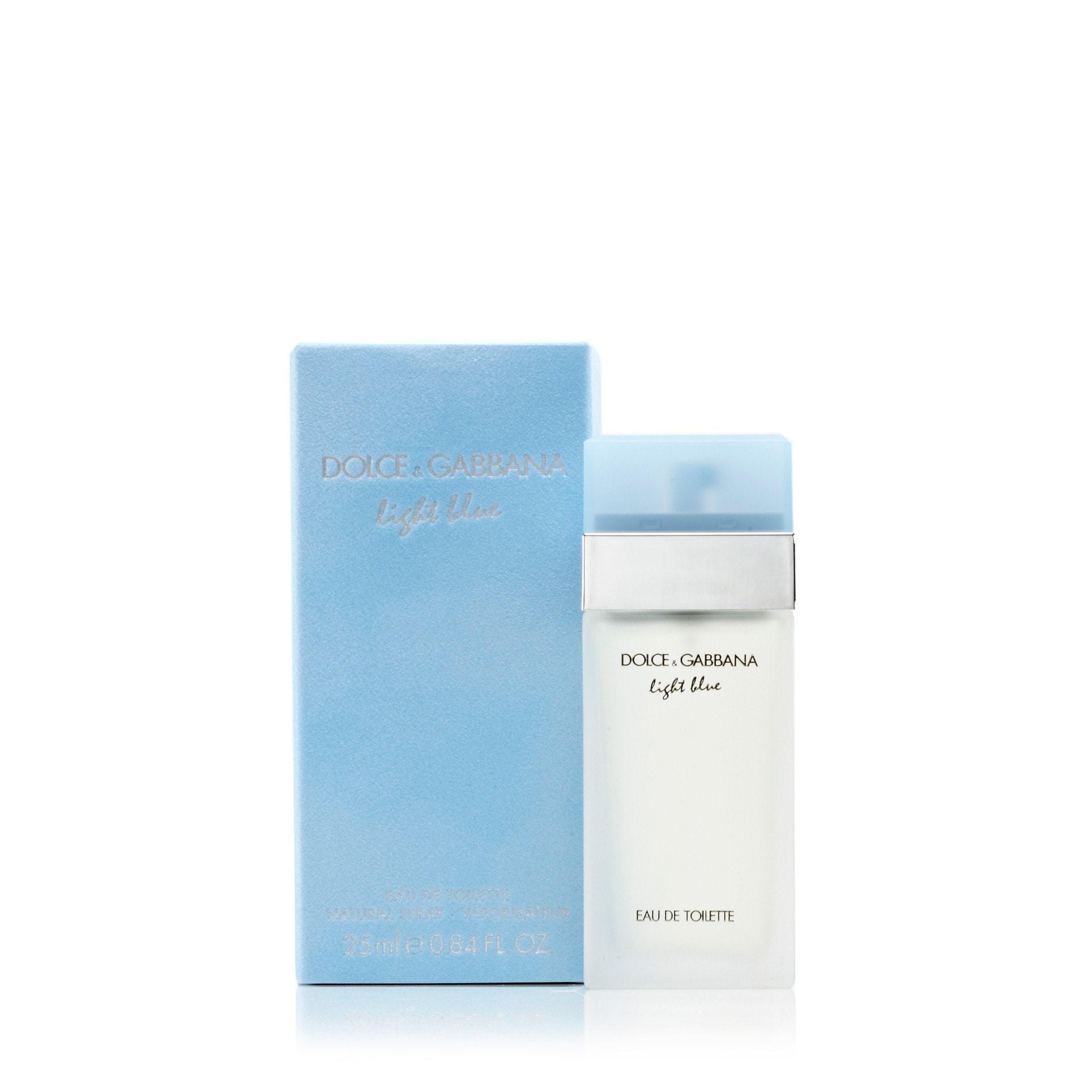
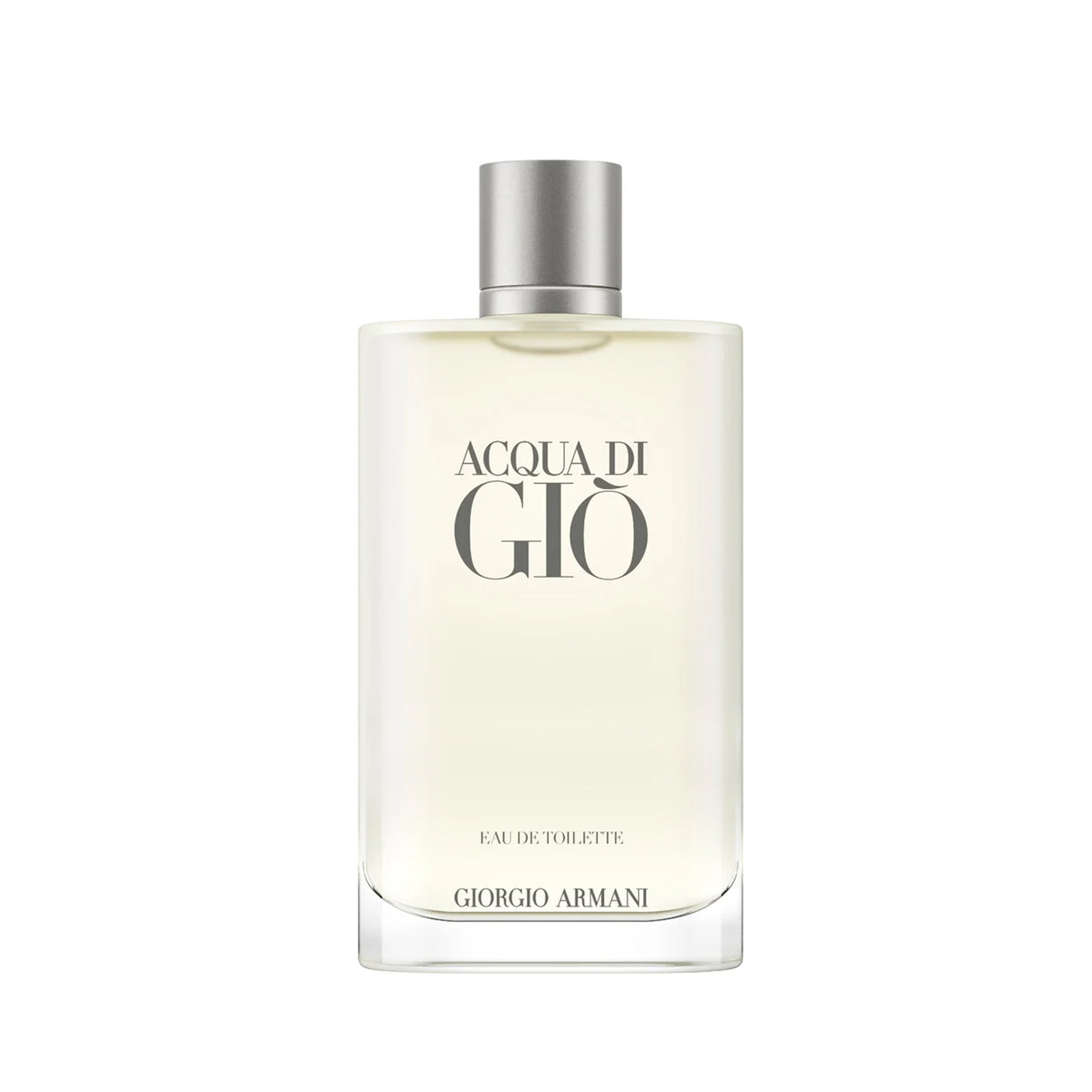
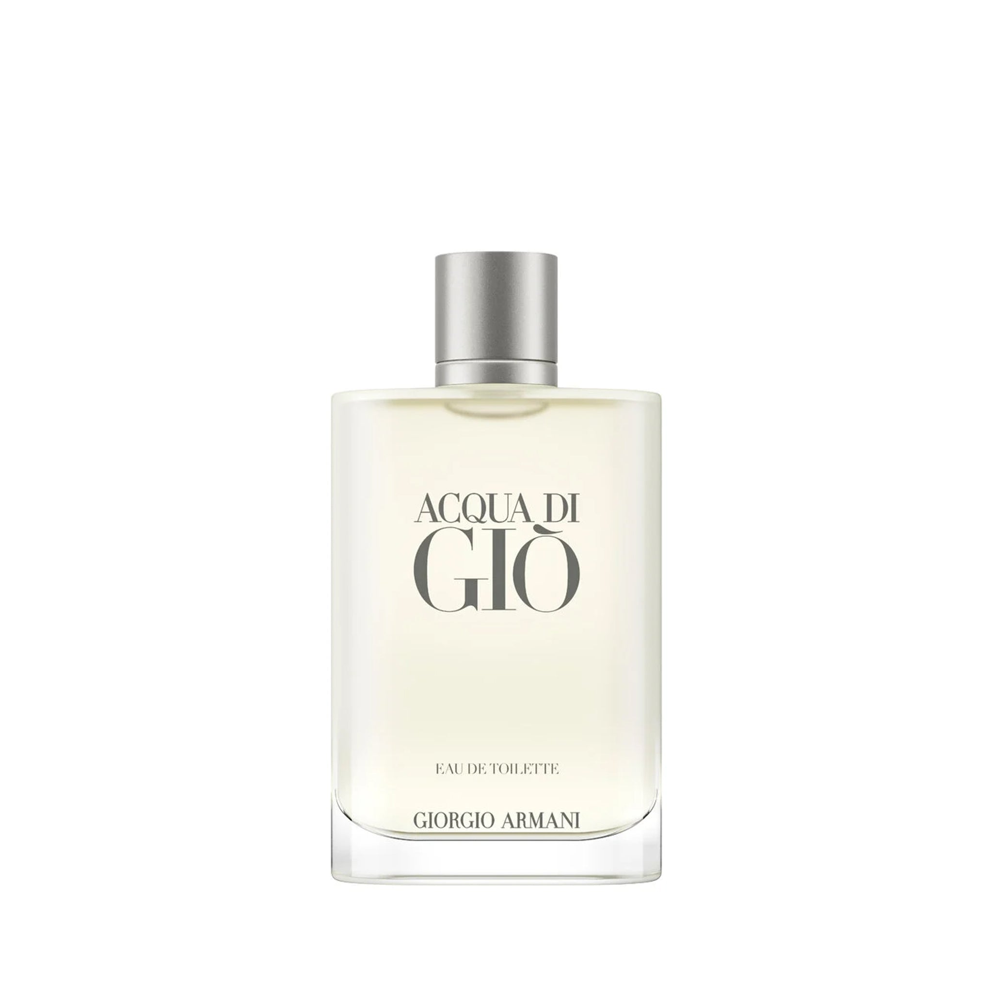
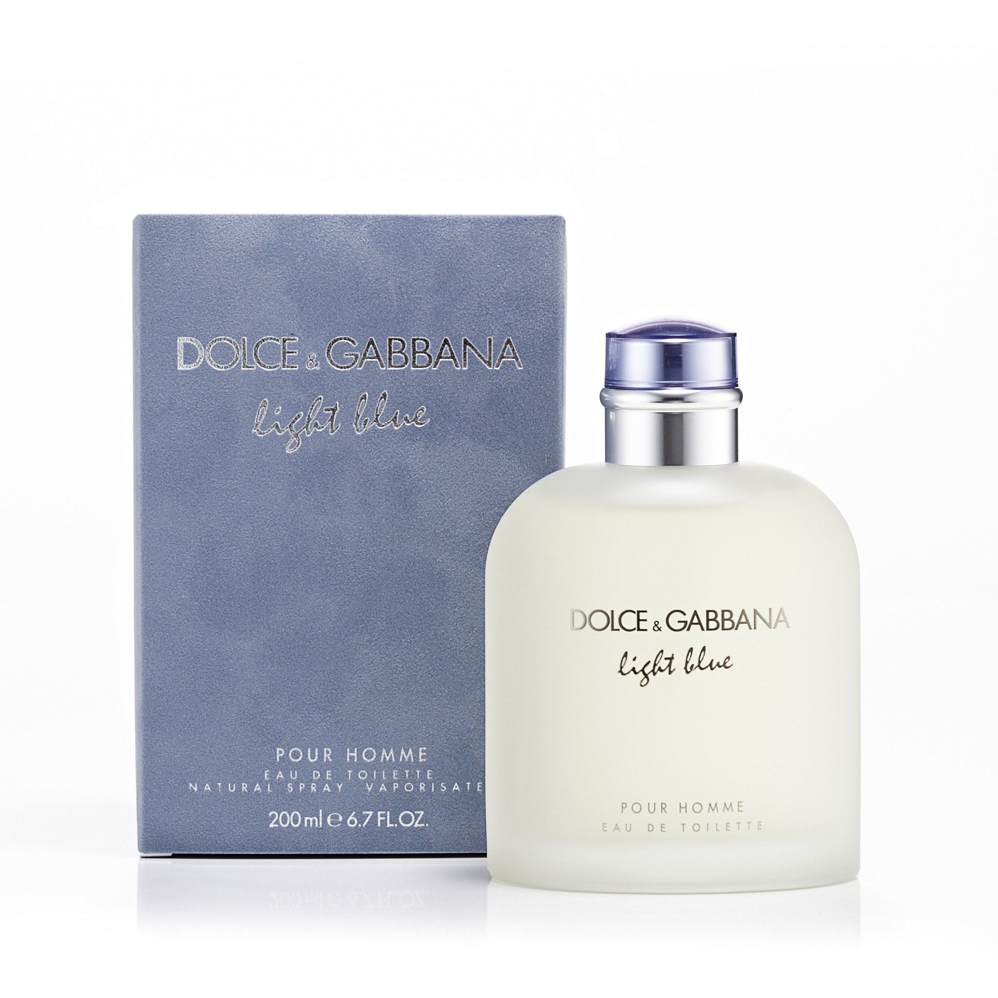
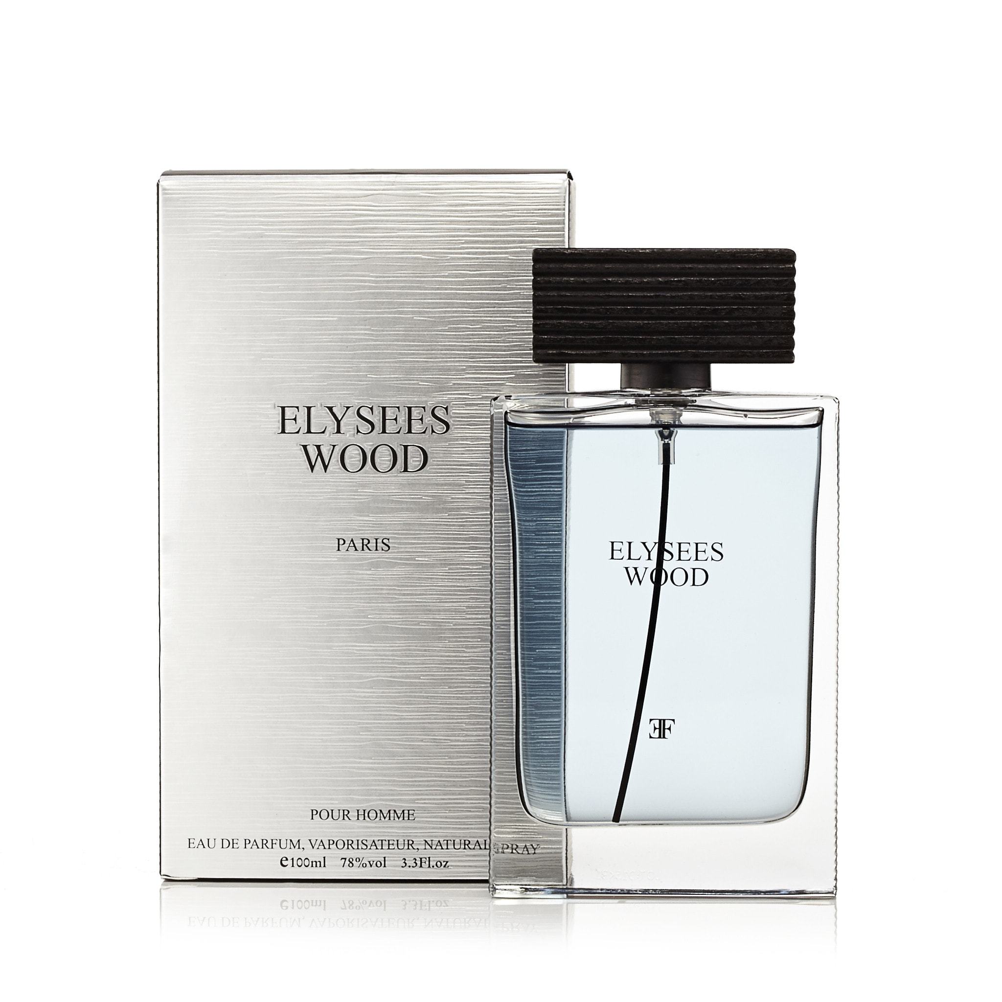
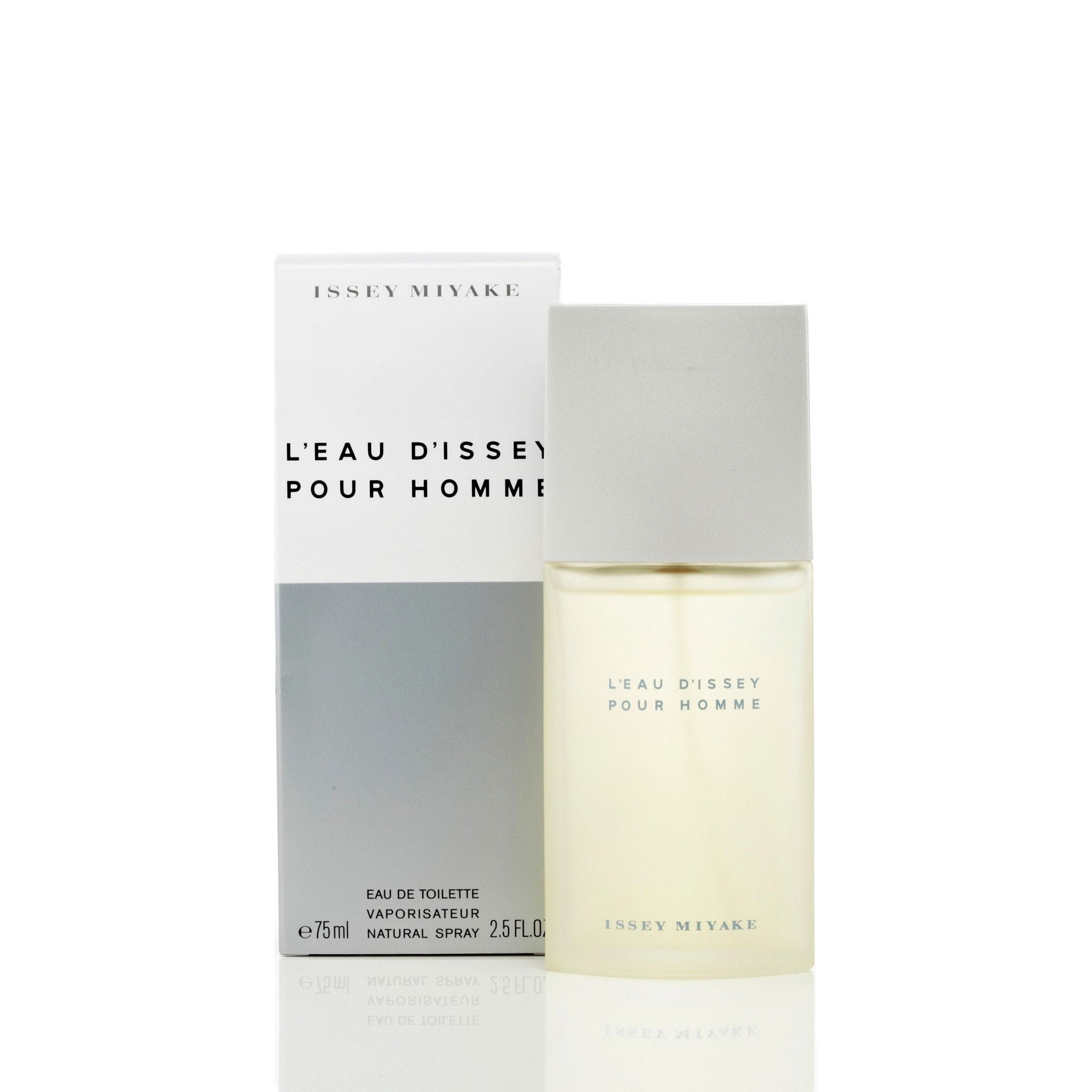
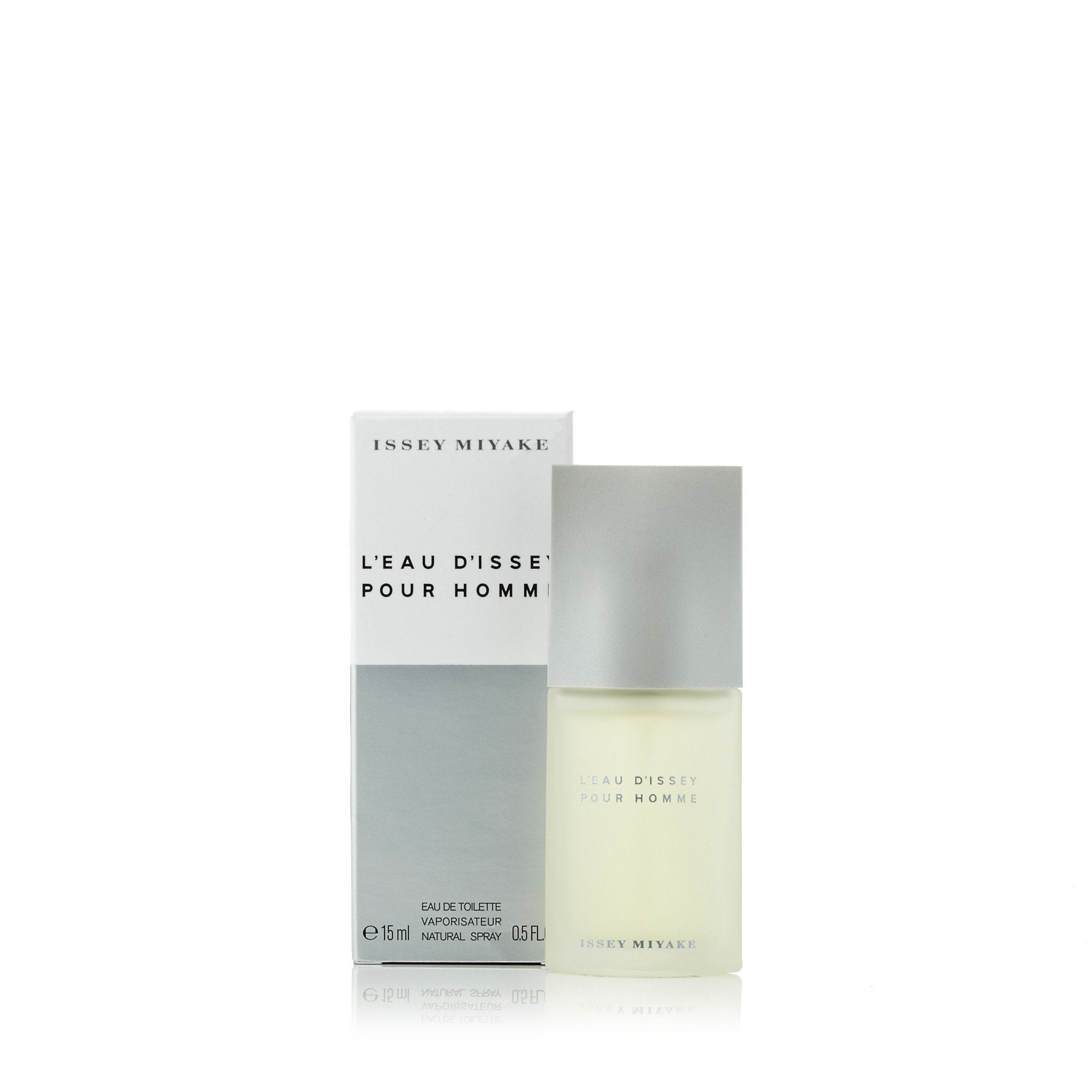
The minimalism trend has taken the design world by storm, and perfume packaging is no exception. Simplicity is now synonymous with sophistication, and perfume brands are embracing clean lines, neutral colors, and understated elegance. However, minimalism in perfume packaging does not mean it is boring. In fact, it is often paired with luxurious materials and finishes that elevate the overall design. Brands like Creed and Notez Library have mastered the art of minimalism with their signature sleek bottles and elegant boxes. These designs allow the fragrance to take center stage while subtle details like textured paper labels, embossed logos, and metallic accents add a touch of opulence. Minimalism in perfume packaging is all about creating a sense of quiet luxury—simple yet significant, modern yet timeless.
- Why It Works: Minimalist packaging appeals to consumers who value sophistication and modern aesthetics. The clean and sleek design exudes luxury without being ostentatious, making it a perfect fit for today's discerning customers.


